ROSHN

ROSHN are a key enabler of Saudi Vision 2030, transforming the urban landscape through human-centric integrated residential developments that elevate connectivity and enhance quality of life.
Project Overview
This project aimed to improve the ROSHN property sales journey by turning a complex, multi-step process into an interactive training simulation for sales teams. The simulation was designed to standardise the residential sales journey and make the process easier to learn, follow, and apply in practice.
Using service-flow analysis and end-to-end UX design, I developed an interactive prototype in Figma with a video game-like feel, ROSHN brand styling, and a scoring system to guide users through the workflow. The result was a training experience that supported consistency, improved understanding, and helped deliver a seamless customer sales journey.
Roles
Agile & Cross-functional collaboration, working closely with the sales team trainers, developers, project manager and stakeholders.
Data Driven UX research, conducting user interviews, usability tests and surveys
Ensure effective, user centric design.
Tools
Figma
Lucid
Adobe Photoshop
Miro
Zoom
Google Workspace.
Year
2025
Client
ROSHN
Investigative Anlaysis
Service design and UX concept for a complex property sales journey
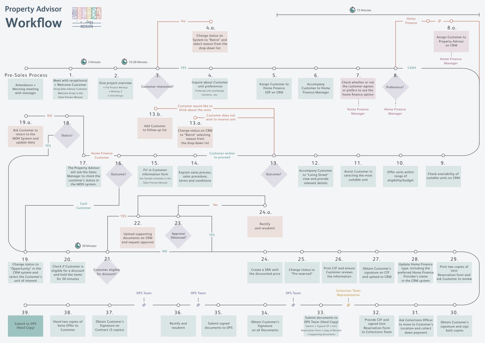
A service flow manual outlined the detailed customer journey that sales teams would follow within the new training simulation. This gave me a strong starting point for understanding the existing service structure and workflow, helping me identify friction points and design the training simulation around the full customer journey.
After analysing the sales manual, I mapped the customer journey, and validated key friction points through interviews with property advisors and sales managers.
User Interviews
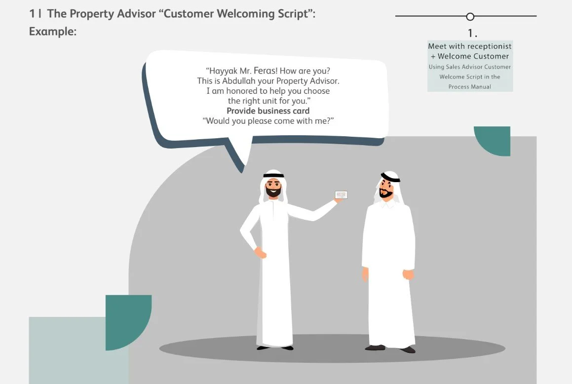
I interviewed property sales advisors to uncover workflow bottlenecks and asked for previous customer research and feedback to understand decision drivers, objections, and clarity gaps at each stage of the journey.
Pain points included;
Unclear explanations of the SEDRA residential project and units available for purchase
Repeated steps in the sales process
Delays and interruptions during the Pre-Sales meeting and handoffs to other staff members that didn’t feel smooth or seamless.
Document-heavy moments, resulting in loss of attention and interest from the customer
Problem
The residential sales journey was complex, multi-stage, and dependent on many handoffs, which created friction for both customers and staff.
Goal
Standardise the customer journey experience and make it easier, clearer, and more engaging for sales teams to learn, by applying the new customer journey in to an engaging game-like training simulation interface that presents the journey in a more approachable and memorable way.
Competitive
Benchmarking
To shape the concept, I benchmarked it against gamified onboarding, sales training simulations, and guided learning platforms such as Salesforce Trailhead to understand how progression, feedback, and rewards support engagement. Because this project was a training simulation rather than a traditional sales tool, the most relevant references were experiences that help users learn by doing and follow a clear step-by-step process.
The benchmarking showed that effective learning experiences keep the user’s path visible, break complex information into manageable steps, and provide immediate feedback through progress indicators, badges, or scoring. This was especially relevant to the ROSHN simulation, where the goal was to standardise a detailed sales workflow and help users understand both what to do and how well they were doing it.
I also reviewed roleplay based training and immersive simulation tools to see how they create realism without overwhelming the user. These examples reinforced the importance of balancing a game like feel with professional clarity so the experience stayed engaging while still supporting a serious training objective.
Key insights
Clear progression helps users stay oriented in complex workflows.
Scoring and feedback can improve retention.
Visual guidance is useful when a process has multiple steps or handoffs.
A game-like aesthetic can increase engagement, but the experience still needs to feel professional and easy to follow.
Design
Requirements
I was asked to design a set of core screens for the training simulation, including a welcome screen, customer menu screen, and an interactive customer video screen. The design direction needed to feel realistic but game-like, visually engaging, and professional, using photorealistic characters, ROSHN brand colours, and an Arabian-inspired visual style. The system also needed to include game-style menus, icons, and badges to support the interactive training experience.
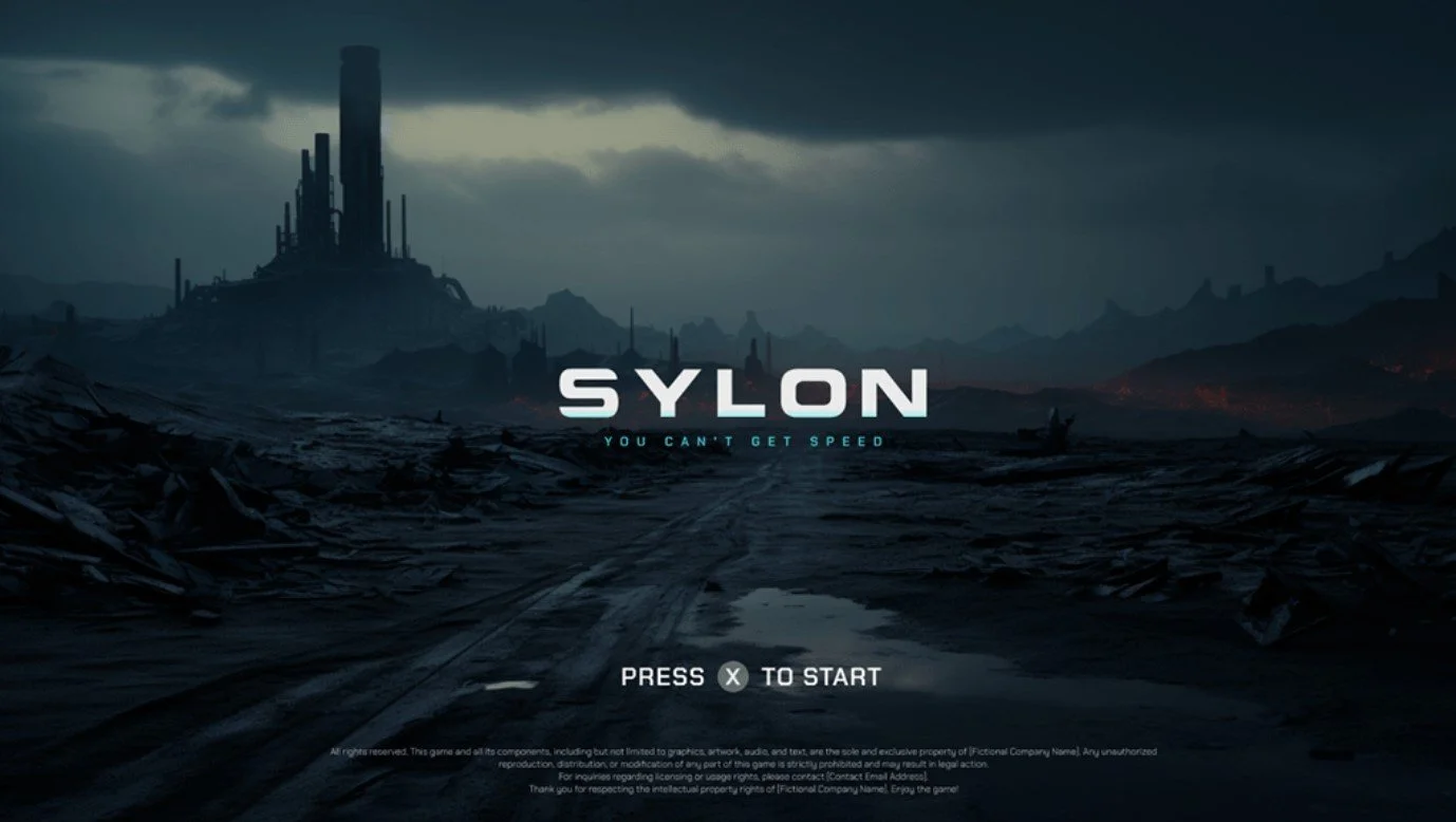
C-level executives requested for the training simulation to have the futuristic feel of video games such as Dune and Sylon whilst merging the vibrancy of the ROSHN brand colours and Arabian style. I researched the games screen states and picked out elements that I could design inspiration from.


ROSHN
Brand Kit
Brand Colours and Imagery


Single Motifs

Brand Logos


Brand Icons


Design Solution
Wireframes
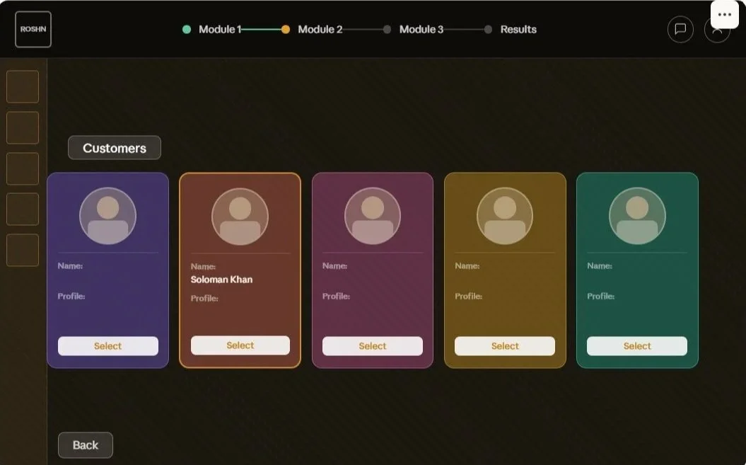
All screens share the consistent top navigation bar with logo, module progress indicators (dot states: empty / amber active / teal complete), the chat and profile icons. The screens following on from the Welcome/Start screen also include a “Back” CTA button.
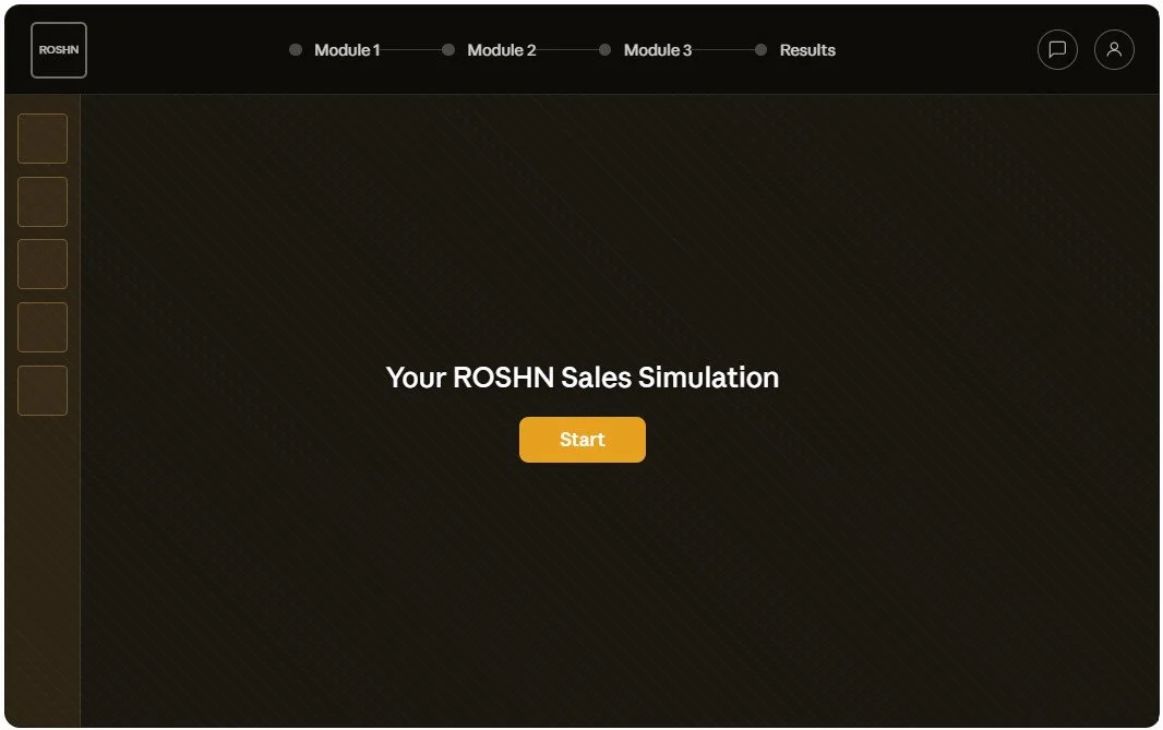
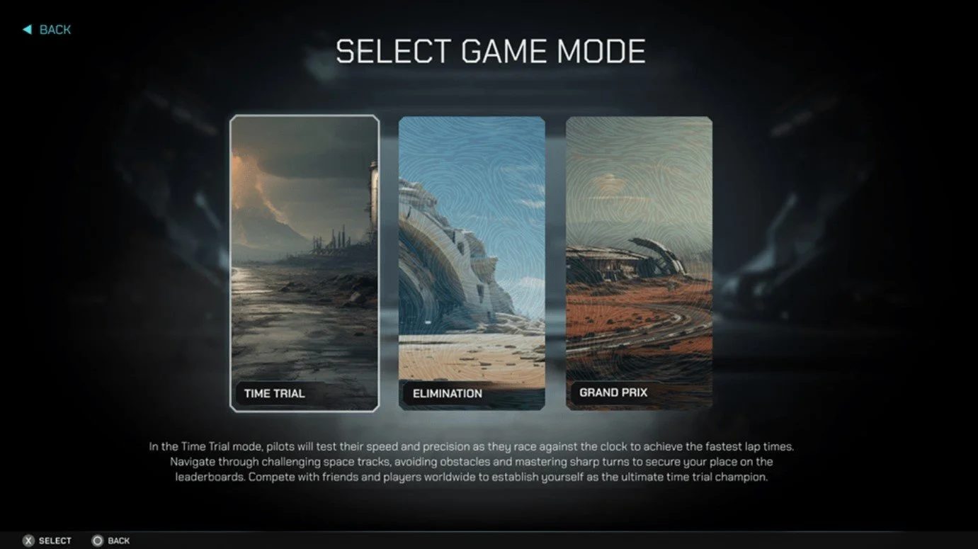
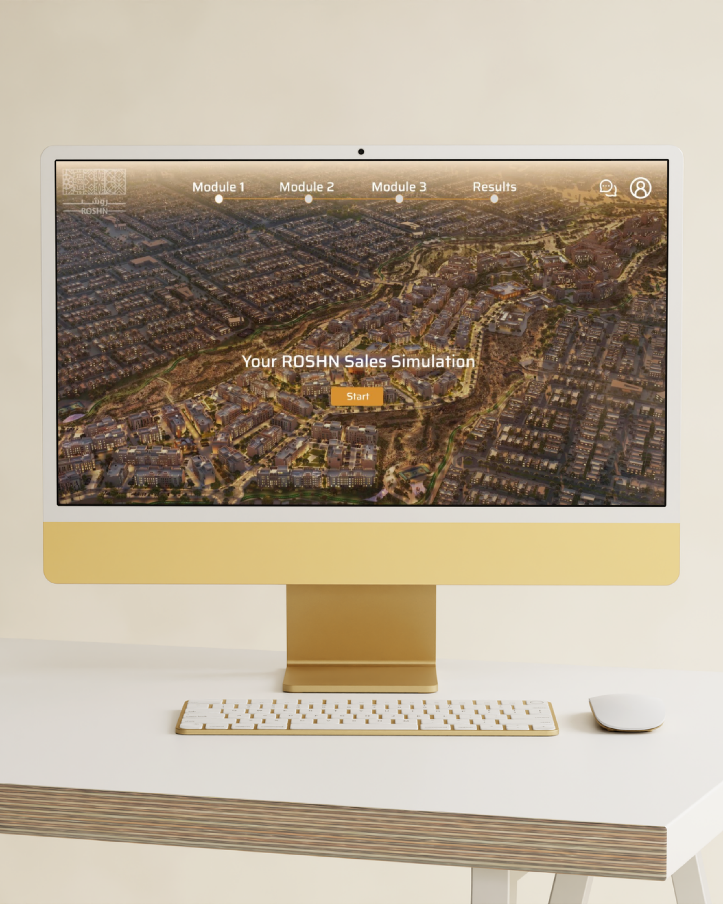
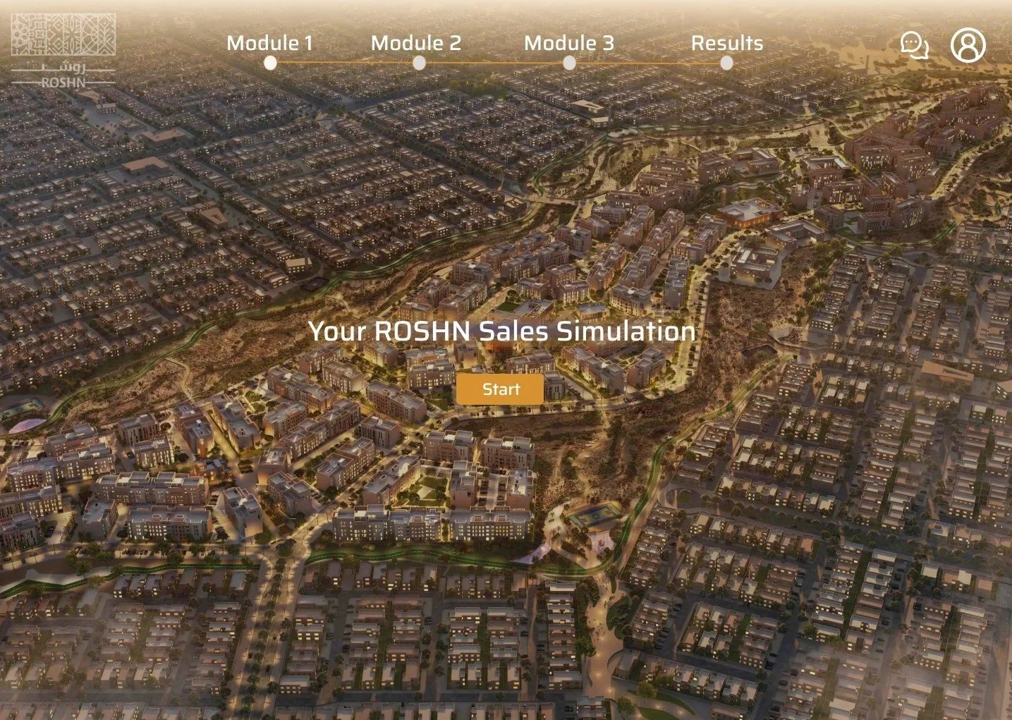
Screen 1 - Welcome/Start
Screen 3 - Customer profile and question selection
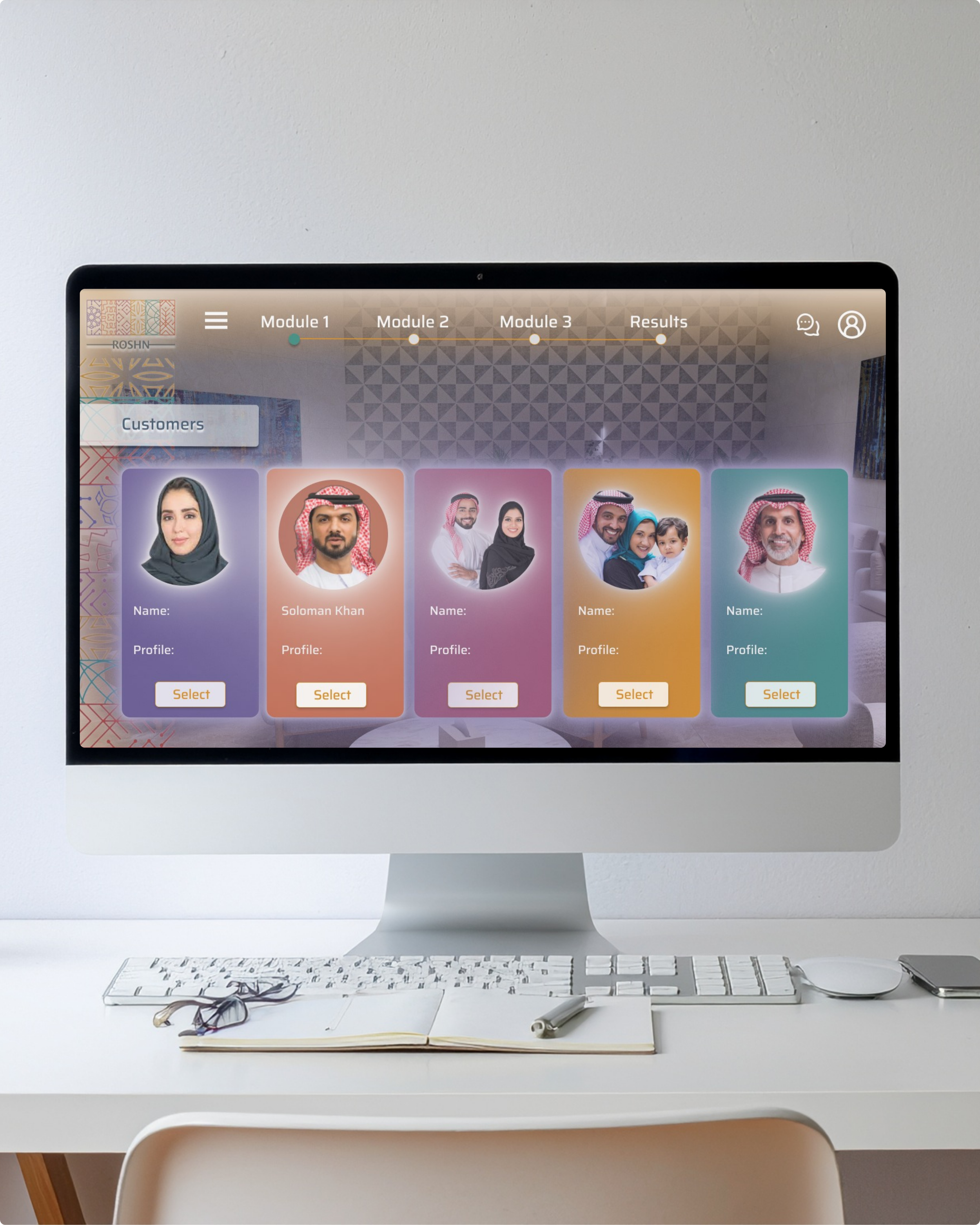
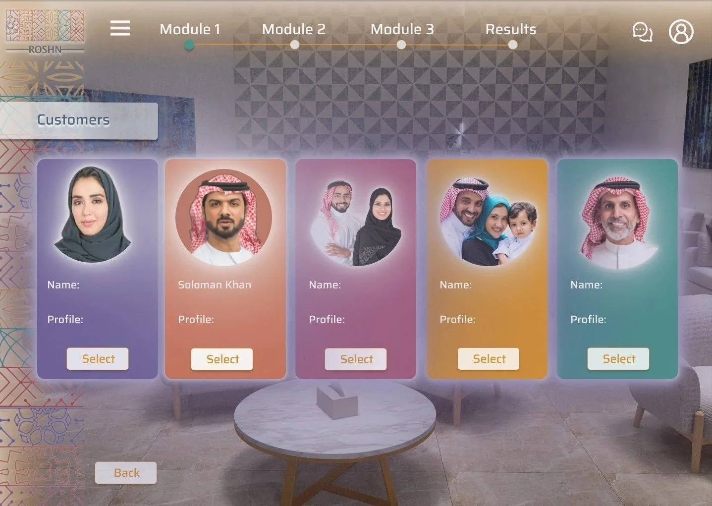
Screen 2 - Customer selection
This shows five colored customer cards in the ROSHN brand colours, in a grid layout taking inspiration from my video game research. Including a "Customers" label and Select buttons for users to navigate which customer they would like to assist in the training simulation first.
One card is highlighted as already named and active. For the purpose of the UI design, one customer’s workflow (Soloman Khan) will be been designed and follow through to the remaining screen states. The design system will be continued for the other customers.
This screen will capture an aerial city background of the SIDRA development, with the centered title and amber "Start" CTA, along with the module progress bar across the top.
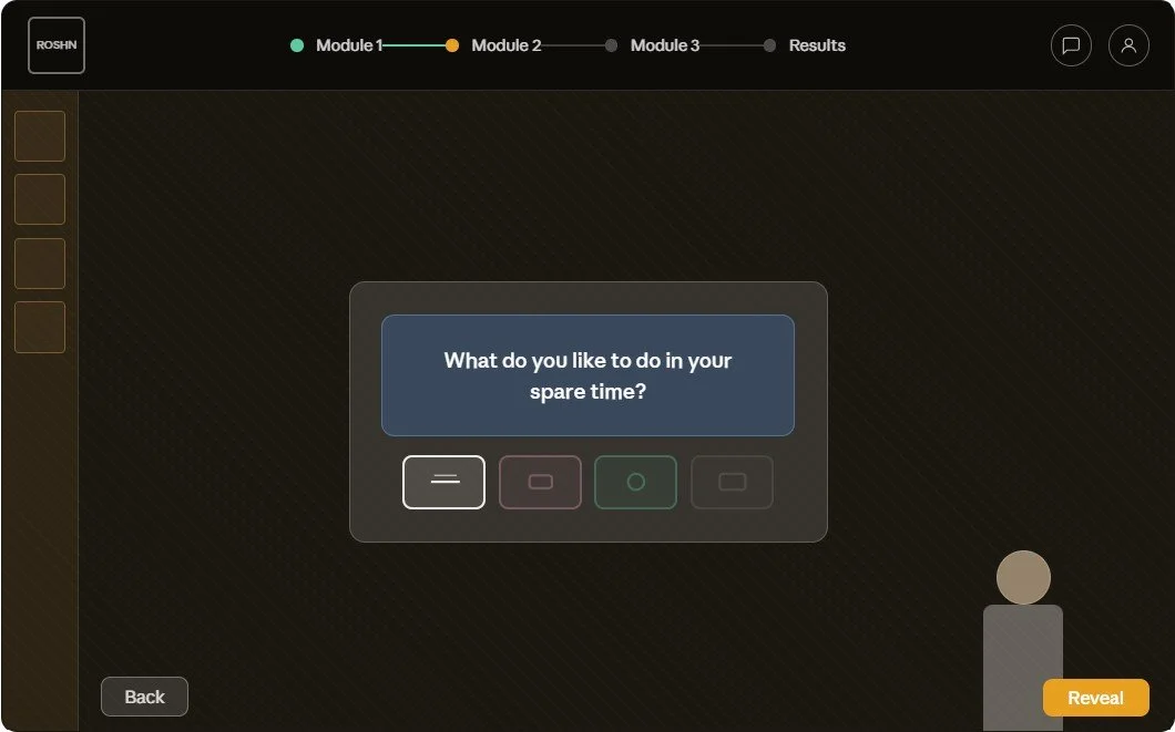
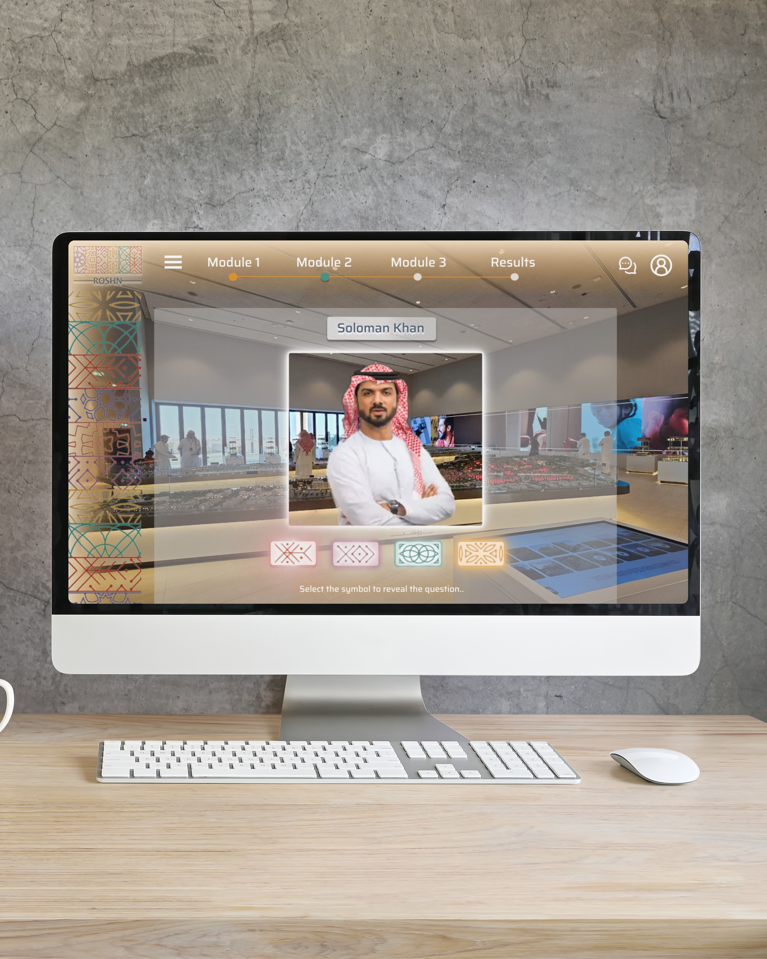
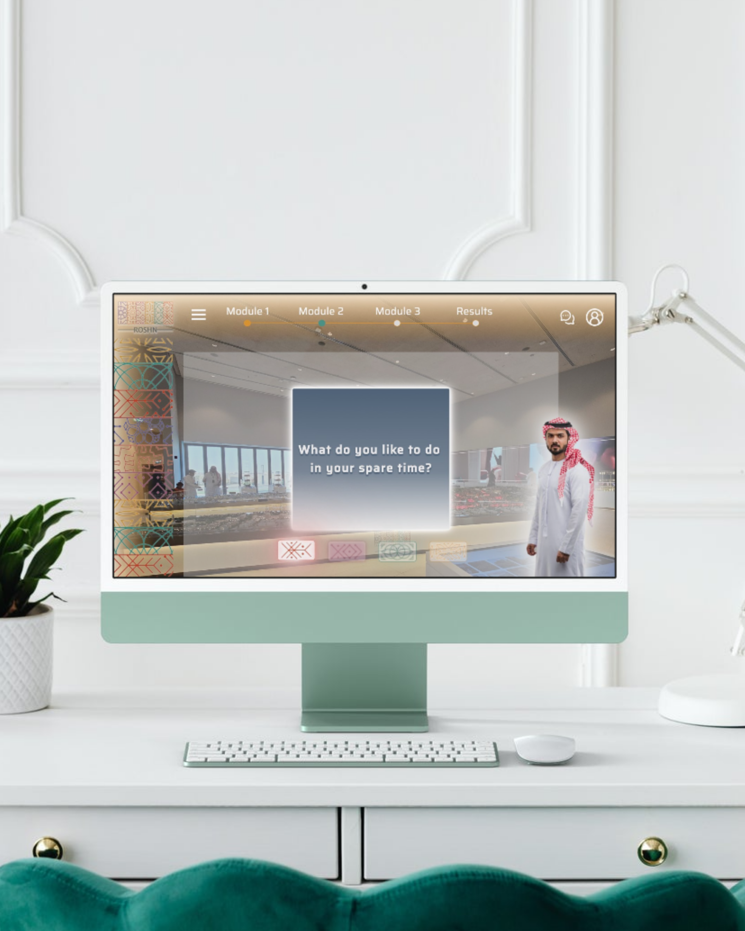
Screen 4 - Question & answer revealed
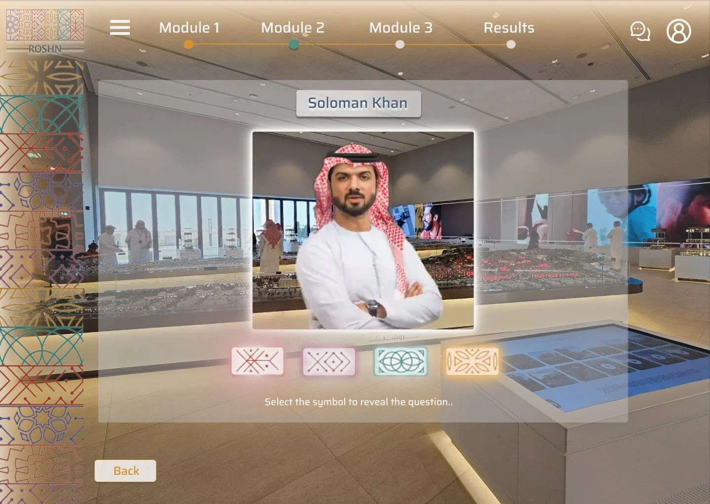
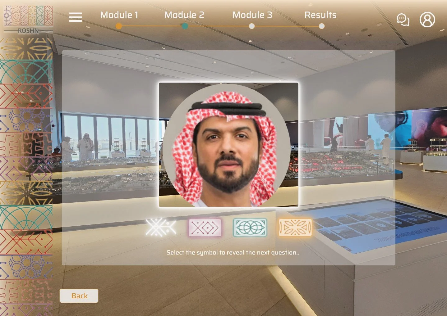
Showing a selection state for the user to choose a symbol which reveals a question to ask the customer. The customer's portrait is in a circular frame with their name badge. The customer portrait is interactive, generated with AI and will speak to reveal information to the user.
Using the four geometric Arabic-pattern symbols from the ROSHN brand kit, they sit below the customer portrait, each representing buttons and a different question for the user to select. Instructions below the symbols say "Select the symbol to reveal the question".
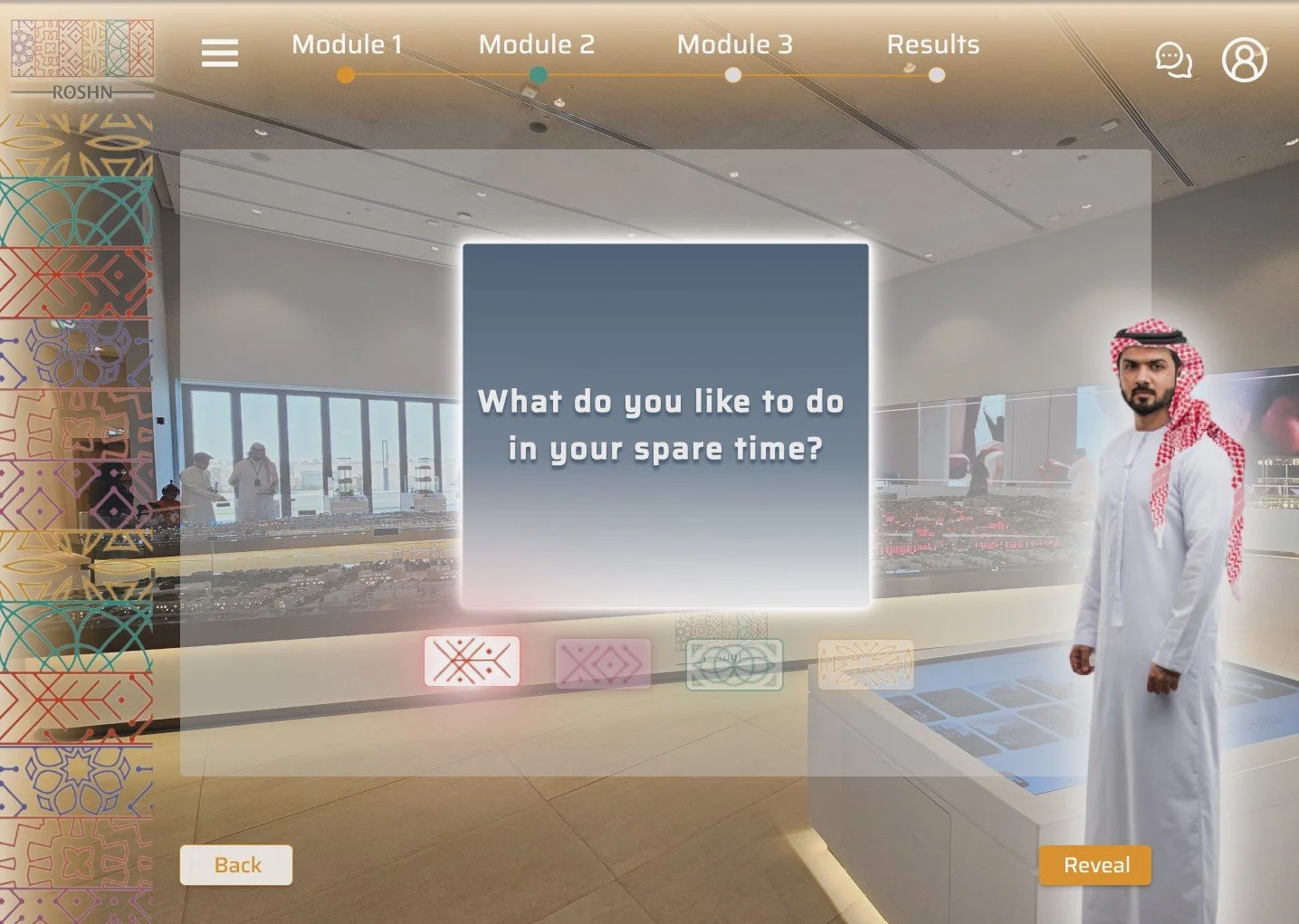
This screen shows the selected symbol highlighted (others dimmed), the question card appearing in blue-grey, and the standing full-body avatar positioned to the right, with the "Reveal" button appearing in the bottom right. Once the “Reveal" button is pressed, the interactive, AI generated character will speak to reveal their answer to the user.
Design Solution
Visual Identity
Visual language I used the ROSHN brand colours, photorealistic characters and brand patterns consistently throughout each screen design, giving the simulation an Arabian-inspired feel that aligns with the brand’s broader visual identity. I used a modern design system for the buttons and navigation bar, taking inspiration from futuristic video games, combining modernity with cultural authenticity. The wanted the design concept to match ROSHN’s positioning as a premium, forward-looking property developer, focused on enriching lives through integrated communities.
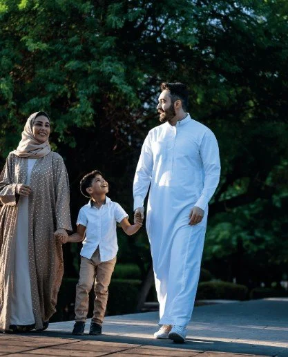
Product experience I wanted the design to mirror ROSHN’s digital approach to the buyer journey, which they describe as streamlined, interactive, and supported by tools like interactive maps, property listings, and transparent digital flows. By using AI generated photo realistic characters and renders of the Sales client meeting areas, I aimed for the prototype to feel like a natural extension of the brand’s customer experience rather than a separate training layer, allowing the user to feel as close as they can to an in person customer scenario.
Design Solution
Welcome/Start
My design of the welcome page establishes the simulation as a guided training journey rather than a generic interface. It combines ROSHN branding, a premium visual style and a clear module-based structure, which matches the goal of creating a realistic but game-like training experience.
The module based navigation, bold start action and cinematic community visual, all support the goal of creating a structured, engaging simulation that feels both professional and interactive.

Design Solution
Customer Selection
I designed the customer selection screen with the goal of creating an interactive, scenario-based training experience. Each profile card introduces a different customer, allowing users to explore individual situations before entering the simulation making the user journey more effective for sales training, because learners can understand each customer’s situation, name, and profile before deciding how to respond.
Visually, I used ROSHN branded colours, a soft, premium interior background that is a render of the real sales office and character led customer options that feel tied to the property sales context, supporting both the game like feel and the structured learning goals of the project.
Design Solution
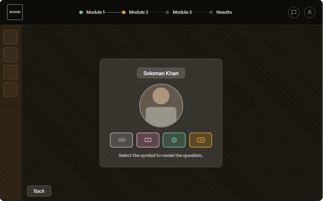
Customer profile and question selection
I designed this screen continuing the interactive training experience. The customer profile of ‘Soloman Khan’ is now situated in the sales room that sales consultants would take their clients in real life (a render of the background sales area was commissioned to be used instead of the background image shown in the design). Solomon continues, explaining his situation in the buying process and allowing the user to reveal various questions to help guide him through the next steps in the customer journey. The appearance of the ROSHN brand kit follows through, by using the brand motifs as symbols, each representing a different question. Upon the selection of the symbol, the question is revealed in a new screen state. The questions represent what the sales consultants should be asking during the sales consultation process.
Design Solution
Question and answer revealed
The sales flow continues, starting the process of promoting the sales consultant with questions to ask their customer. I decided to create two screen states rather than one, as discussed with the sales teams. The reason for this, was that the question needed to be revealed and then answered and then a new question needed to be selected using the symbols. This created a clearer user flow.
Complete
Design Solution
Prototype
Testimonials
"This simulation was an effective and thoughtful solution to a complex sales training challenge. It turned Roshn’s property sales process into a clear, interactive experience that helped standardise the customer journey across teams…
Rebecca did an excellent job balancing professionalism with a game-like feel, while keeping the experience aligned with the ROSHN brand. The final result was engaging, visually polished and practical for training purposes.
I would recommend her work to any team looking for someone who can combine UX thinking, visual design and process understanding effectively”
— Gifford Yates, Director of Client Services