nomad.
During my UX Design Professional Diploma, I was tasked with designing and building an end to end website for the hotel booking industry. This resulted in the creation of ‘Nomad.’, a conceptual online booking platform, aimed at enhancing the user experience, solving user problems and frustrations during the online hotel booking process, allowing me to apply the full spectrum of UX processes.
PROJECT GOAL
The key objective was to identity and resolve common usability issues and enhance the user experience, by comparing user research, identifying users goals, context and behaviors to create a seamless booking experience.
Year
2023/2024
Client
UX Design Institute Coursework
TOOLS
Figma
Miro
Google Meet
Google Sheets
ROLES
Research
Analysis
Design; Wireframing,
Prototyping & Annotations
Research

USABILITY TESTING - NOTE TAKING
I observed a range of usability tests for a variety of desktop hotel booking sites. Focusing on identifying user pain points, positive interactions and user suggestions for each participant. I used visual hierarchy in my note taking, to identify key points ready for analysis.
USABILITY TESTING - OBSERVING
I participated in three usability tests across four websites, leading one and observing two. Each test began with an in-depth interview to uncover the participant’s goals and motivations. By guiding participants through essential booking tasks, I could see first-hand where they encountered friction and what expectations they had for each step of the booking process.
COMPETITIVE BENCHMARKING
This was key to understand the current landscape of hotel booking websites. I analysed a range of leading booking websites focusing on how well they addressed user needs during the initial location and hotel search along with finalising the booking. The goal was to identify successful design patterns, common challenges, and potential areas for improvement.
Key Insights
Overall, my research revealed a number of strengths and user expectations during their hotel booking experience;
Aesthetic Images. Being able to look through a range of aesthetic images and lots of them.
Identify Discounts. Viewing discounts and offers by searching through the calendar and comparing dates that might be cheaper.
Filter Their Search. Given the option to filter their search to create a personalised experience.
Minimalist Layout. The power of experience personalisation, user-centric design, and minimalist layouts that prioritise key information.
Key Insights
During this research technique, some of the same expectations from the competitive bench making technique were highlighted, along with some new insights;

Aesthetic Images
The use of clear images and lots of them!

Amenities List
Being provided with as much information
about the hotel and amenities early
on in the booking process.
Reviews
The ability to review and compare previous
customer reviews and search for specific
aspects of their stay
Saving Money
Feeling like they have saved money or
managed to get ‘a good deal’.
Map View
Expectation to view hotels and compare
their location on a map view

Filters
Being given the option to filter through
their preferences to find a hotel that
meets the users specific needs.
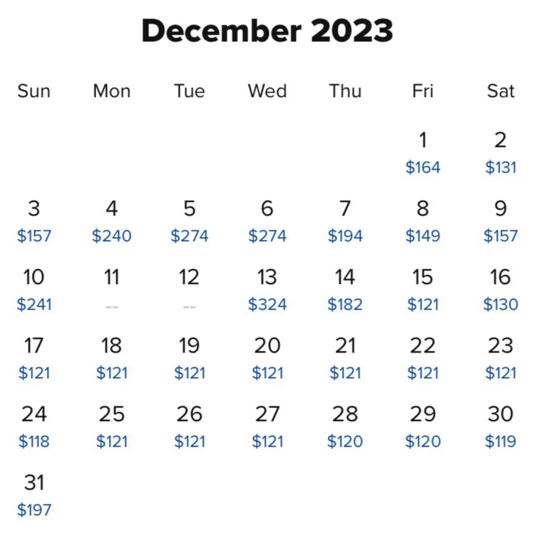
Pricing Comparison
Ability to view and compare prices in
advance in a calendar view to potentially
save money on cheaper dates

Personalised Stays
Luxury benefits or ‘add on’s’ that
make their stay special to them.
After gathering a wealth of observations and feedback, my next step was to transform these insights into clear, actionable design directions. I began by creating an Affinity Diagram alongside a Customer Journey Map to organise and interpret the data effectively.
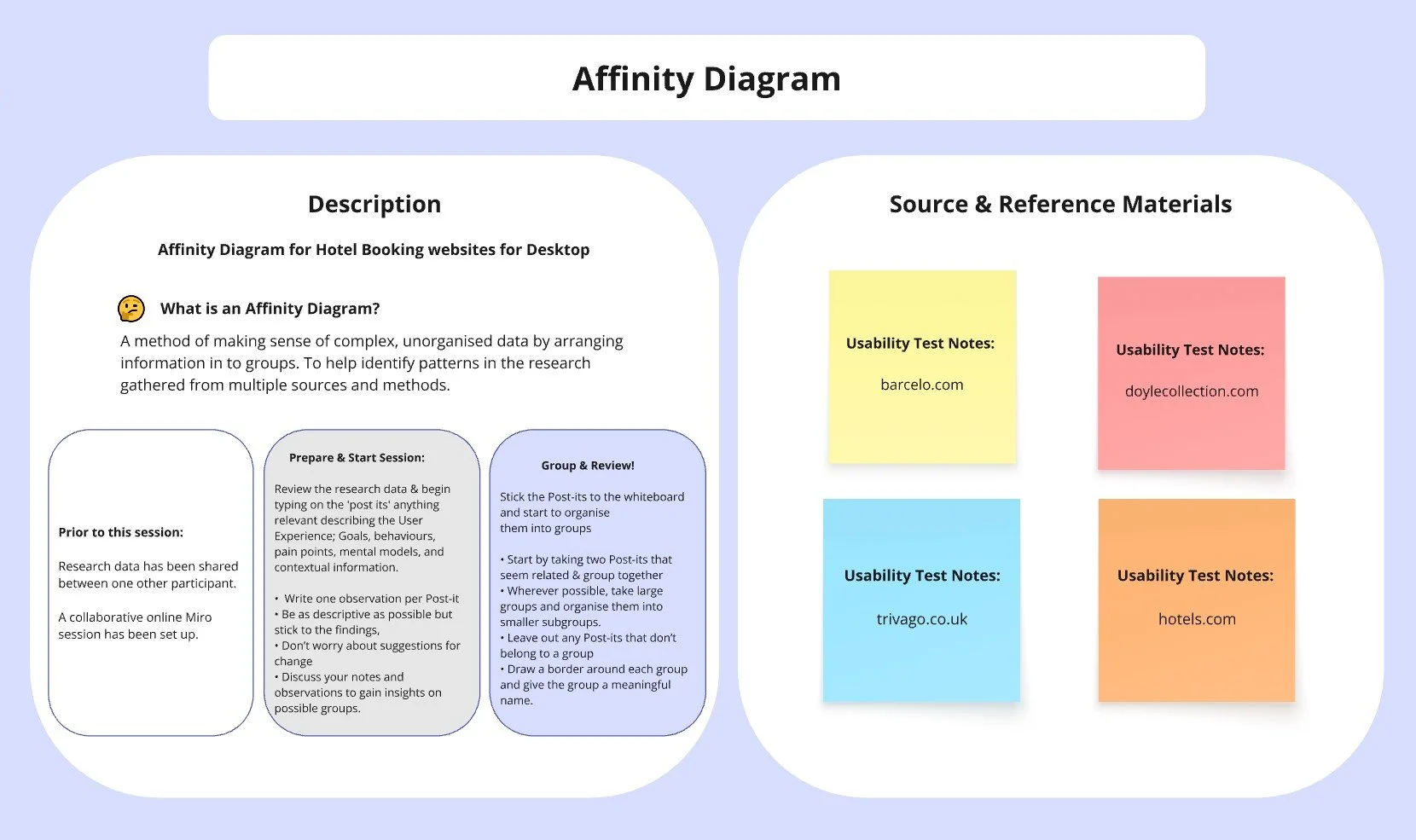
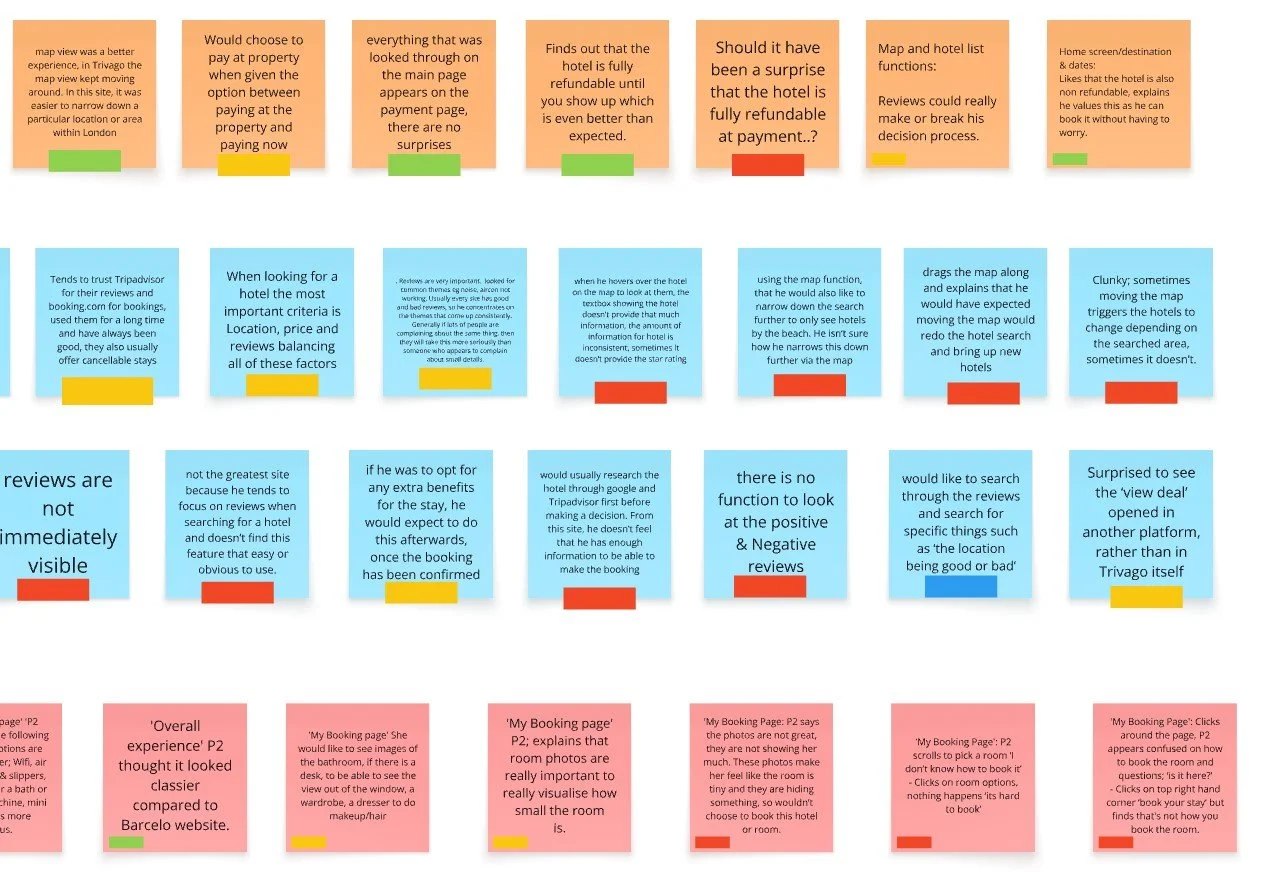
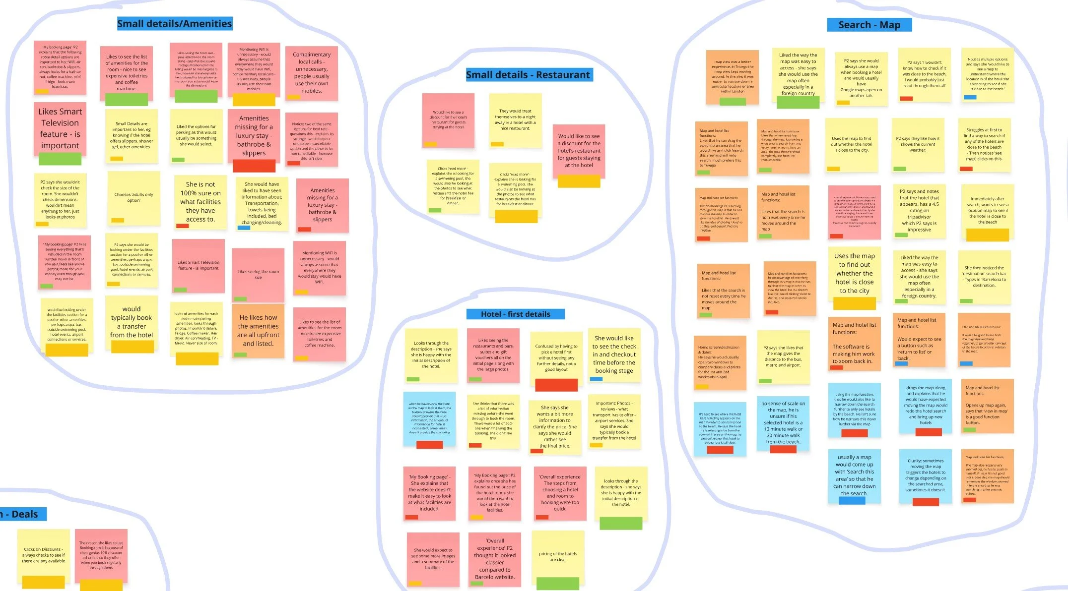
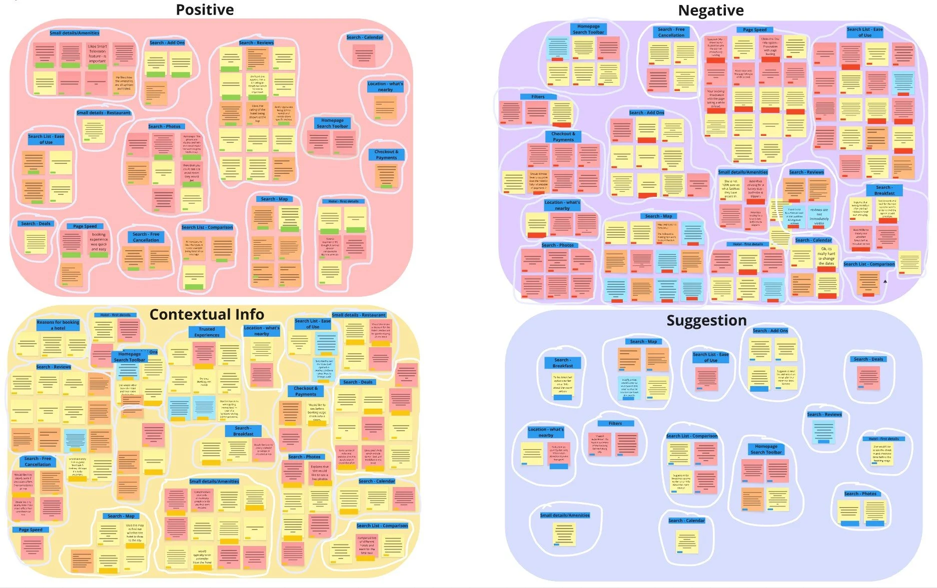
Affinity Diagram
I created an affinity diagram to visually group and categorise the insights I had collected from my research. The session was conducted over a collaborative session via Miro with two other participants.
The Process
The research was reviewed prior to the session by the participants.
They were instructed to type out any relevant information describing the user experience on to a post-it note, a different colour note was used to identify the data source and reference material.
The post-it’s were labeled in a colour tag to identify User Suggestions (Blue), Positive Interaction (Green), Negative Interaction (Red), Contextual Information (Yellow).
The notes were first organised in to categories, some examples include; ‘Reasons for booking a hotel’, ‘Small Details - Amenities’, ‘Homepage’, ‘Search Toolbar’, ‘Page Speed’, ‘Filters’ and ‘Search - Reviews’.
They were then Defined in to further groups, collecting all post-its that represents; User Suggestions, Positive Interactions, Negative Interactions and Contextual Information.
Analysis
-
![]()
Overview
-
![]()
Gather
-
![]()
Group
-
![]()
Define
Customer Journey Map
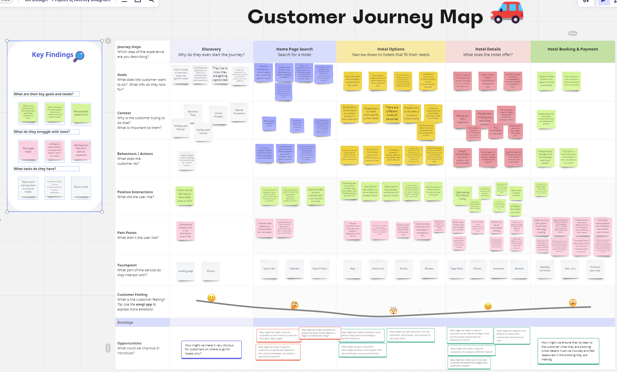
After using the Affinity Diagram to identify common themes, I created a Customer Journey Map to bring the typical user experience to life. This map visualises each step of the booking process, highlighting user goals, frustrations, and positive interactions, helping guide my design decisions toward a seamless, intuitive experience.
Journey Steps
Key steps included, Discovery, Home Page Search, Hotel Options, Hotel Details and Hotel Booking & Payments.
I then included a horizontal column used to categorise;
User Goals, Context, Behaviors/Actions, Positive Interactions, Pain Points, Touchpoint, Customer Feeling.
I then thought about the Opportunities and value add for each stage of the Customer Journey, I identified questions, allowing me to think about what can be improved or introduced at each stage.
Design Insights
Whilst a range of topics were uncovered from the analysis stage, I naturally asked myself the questions;
What are the users key goals and needs?
Want to easily find information about a specific hotel that is important to them.
Want to know if the hotel is going to be good; including lots of photos and reviews are some common tools.
Personalised experiences.
What do they struggle with the most?
Slow Page loads
Ambiguity about what’s included/not included in the hotel booking
Site features that don’t work as expected
What tasks do they have?
Search and narrow down to a list of hotels
Compare hotels - price, location, photos, reviews and amenities
Book a hotel
Design
With key insights from my research, I began transforming ideas into actionable designs. From initial flows to interactive prototypes, each step aimed to bring clarity and ease to the booking experience, creating a seamless user experience.
With key insights from my research, I began transforming ideas into actionable designs.
From initial flows to interactive prototypes, each step aimed to bring clarity and ease to the booking experience, creating a seamless user experience.
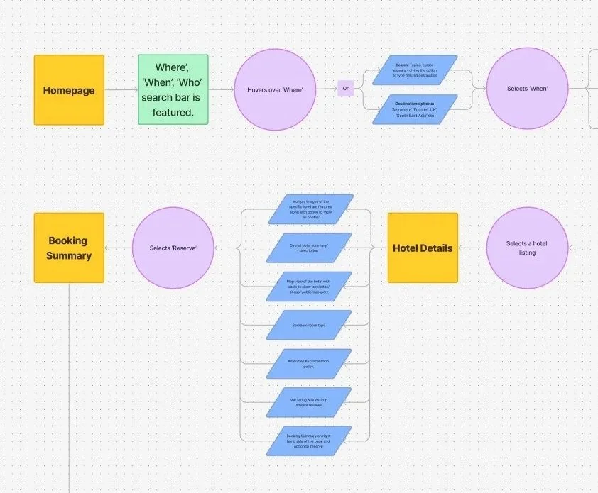
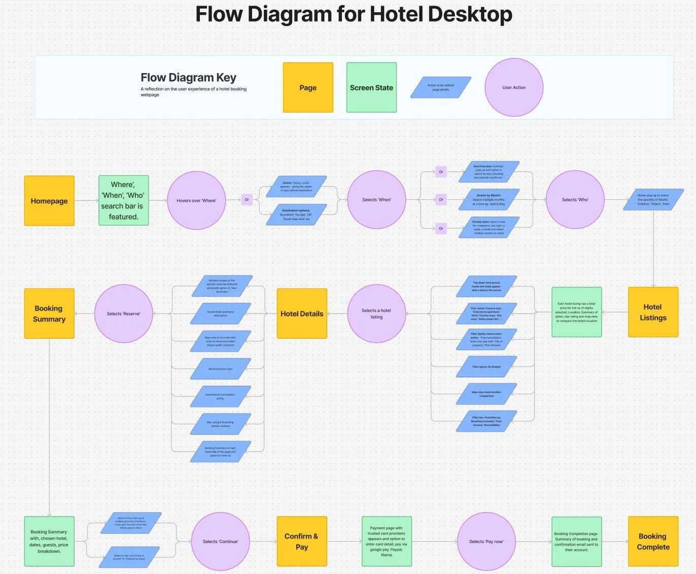
Flow Diagram
After analysing user needs and pain points, I mapped out the primary user flow. The
flow diagram outlined the essential paths users would take from start to finish, addressing key
touch points and minimising friction throughout the journey.
The Process
I created a key for the Flow Diagram, with different colours/shapes identifying the ‘Page’, ‘Screen State’, ‘Action to be added/Page details’ and ‘User Action’.
Each phase of the flow was fine tuned to prioritise high priority tasks and reduce user friction. This careful planning creates a seamless journey, guiding users intuitively from search to booking confirmation. It was important to create a flow that would be clear and provide user confidence when following through to the payment stage.
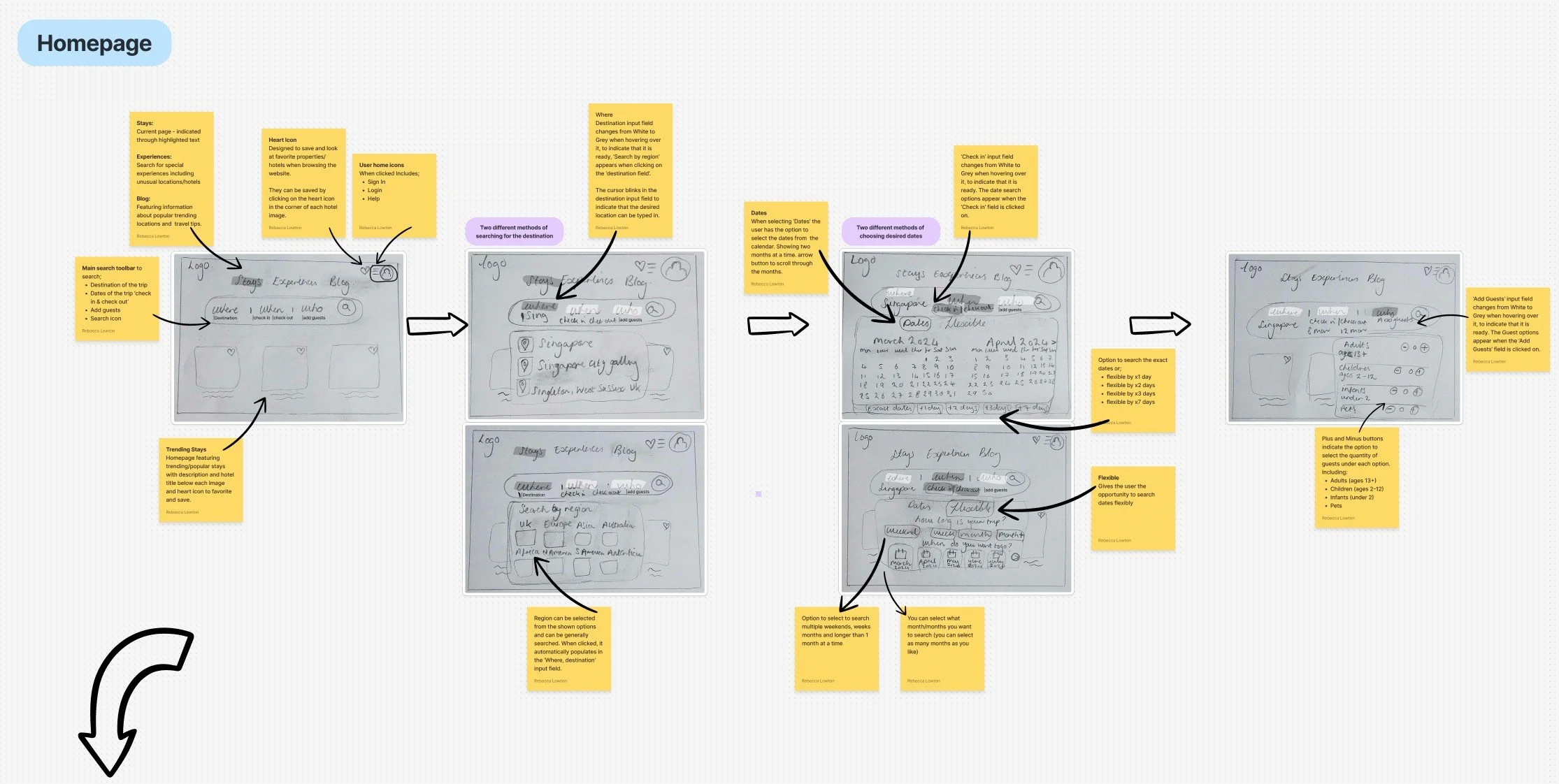
Sketching
With the core flow in place, I developed early sketches to explore layout options and interaction design. These rough drafts allowed me to test different ideas, refining the navigation, information clarity and ease of access for key features.
Prototyping - wireframe
After validating early sketches, I progressed into prototyping to establish and test the websites structure and flow. Starting with low-fidelity wireframes, my focus was on refining layout and functionality, defining a cohesive, intuitive design.
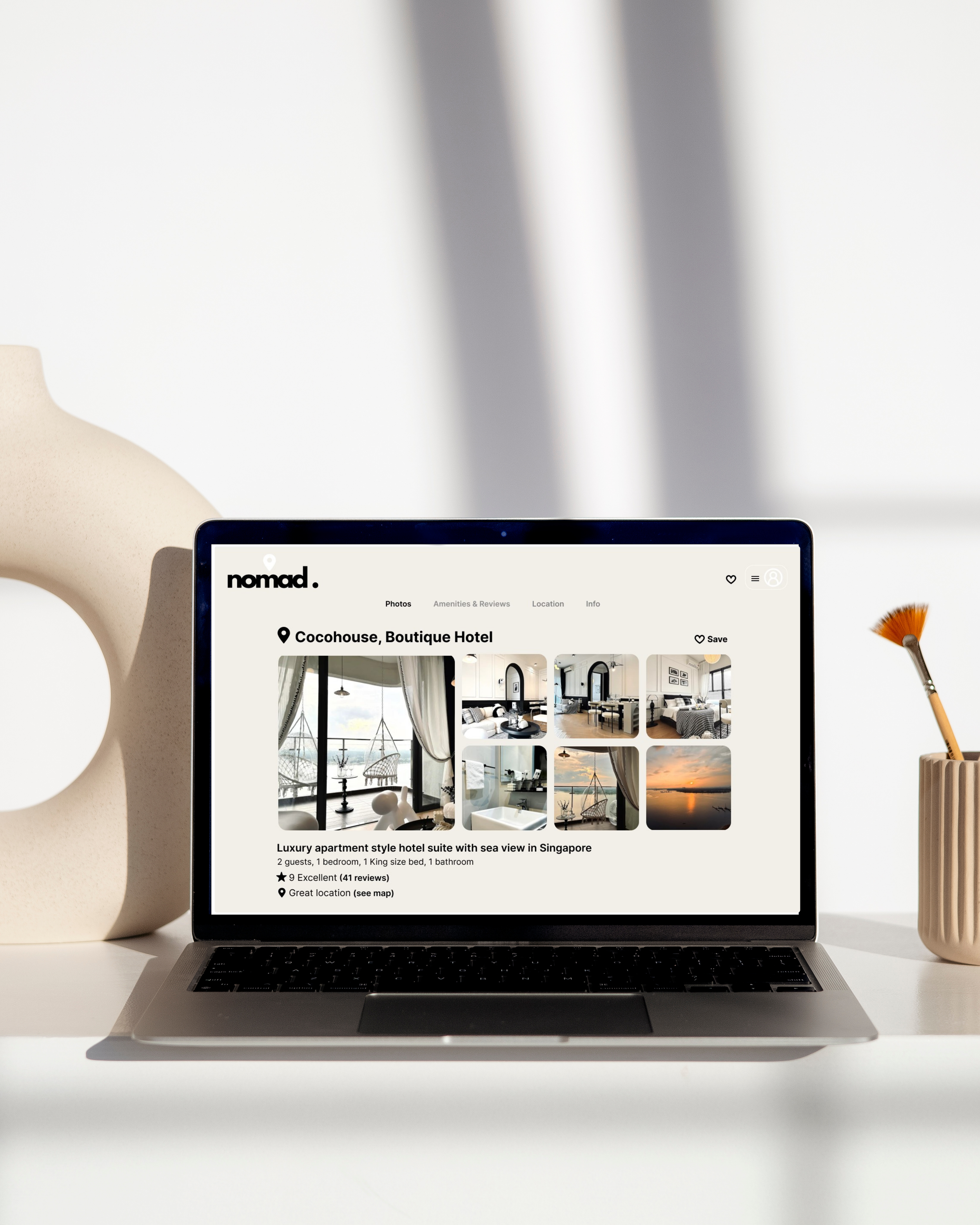
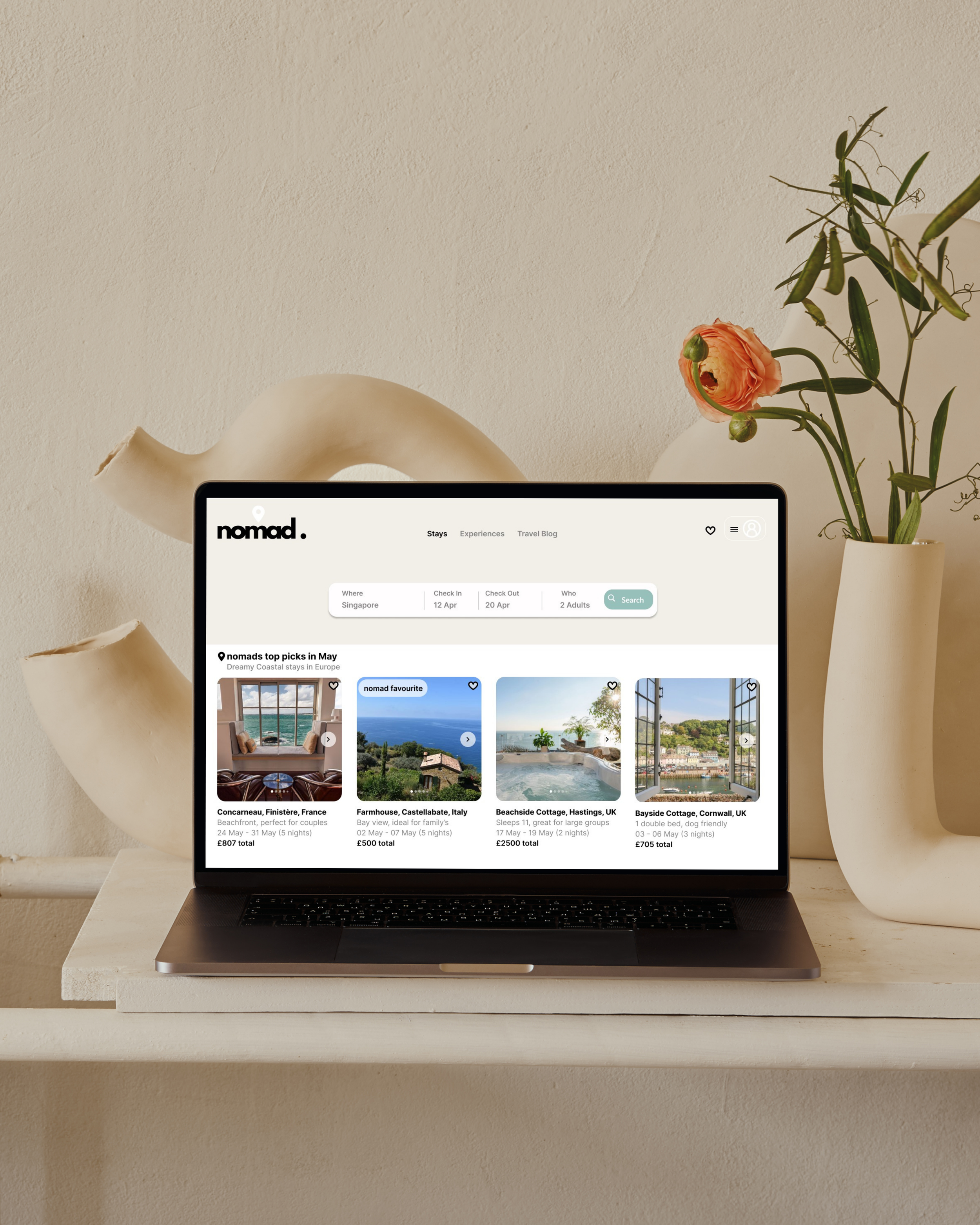
Prototyping - high-fidelity prototype
Building upon the foundations of my low-fidelity wireframes, the high-fidelity prototype incorporated visuals, branding and interactions to bring the user experience to life. Whilst most elements are clickable, the prototype follows the core user flow, representing the booking journey from the initial search to booking confirmation.
Features
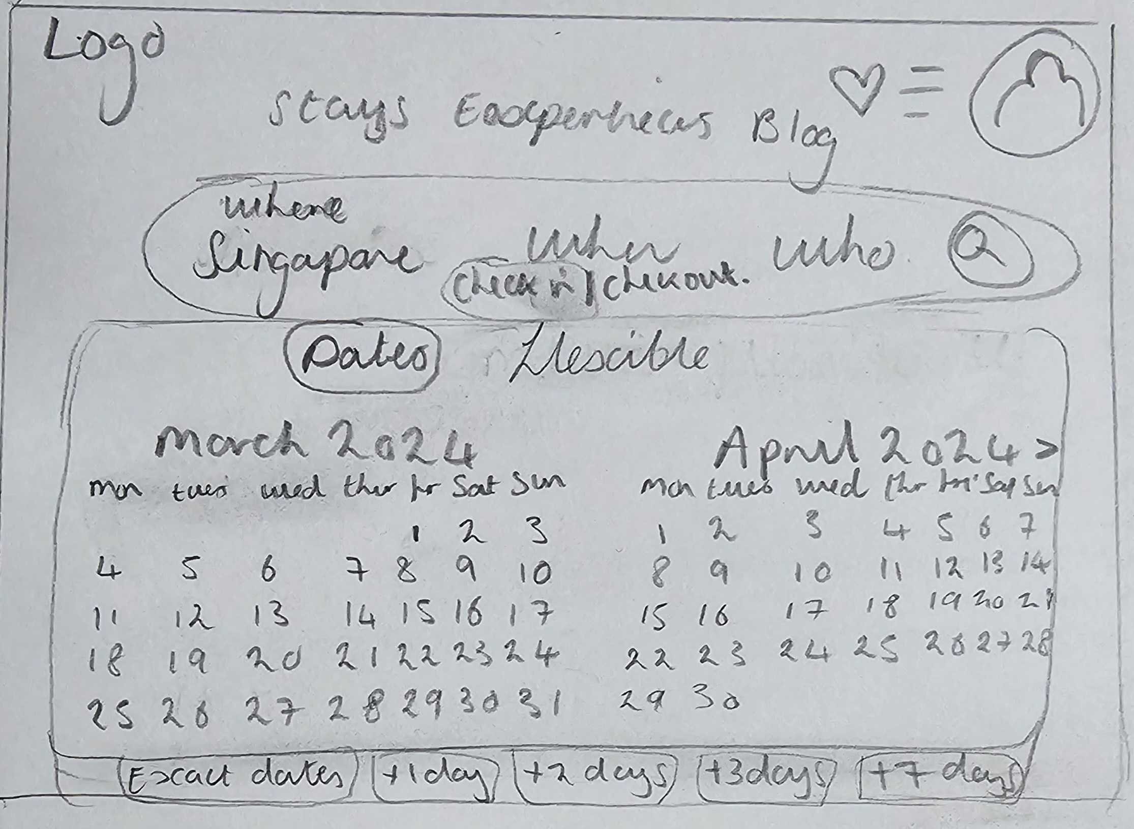
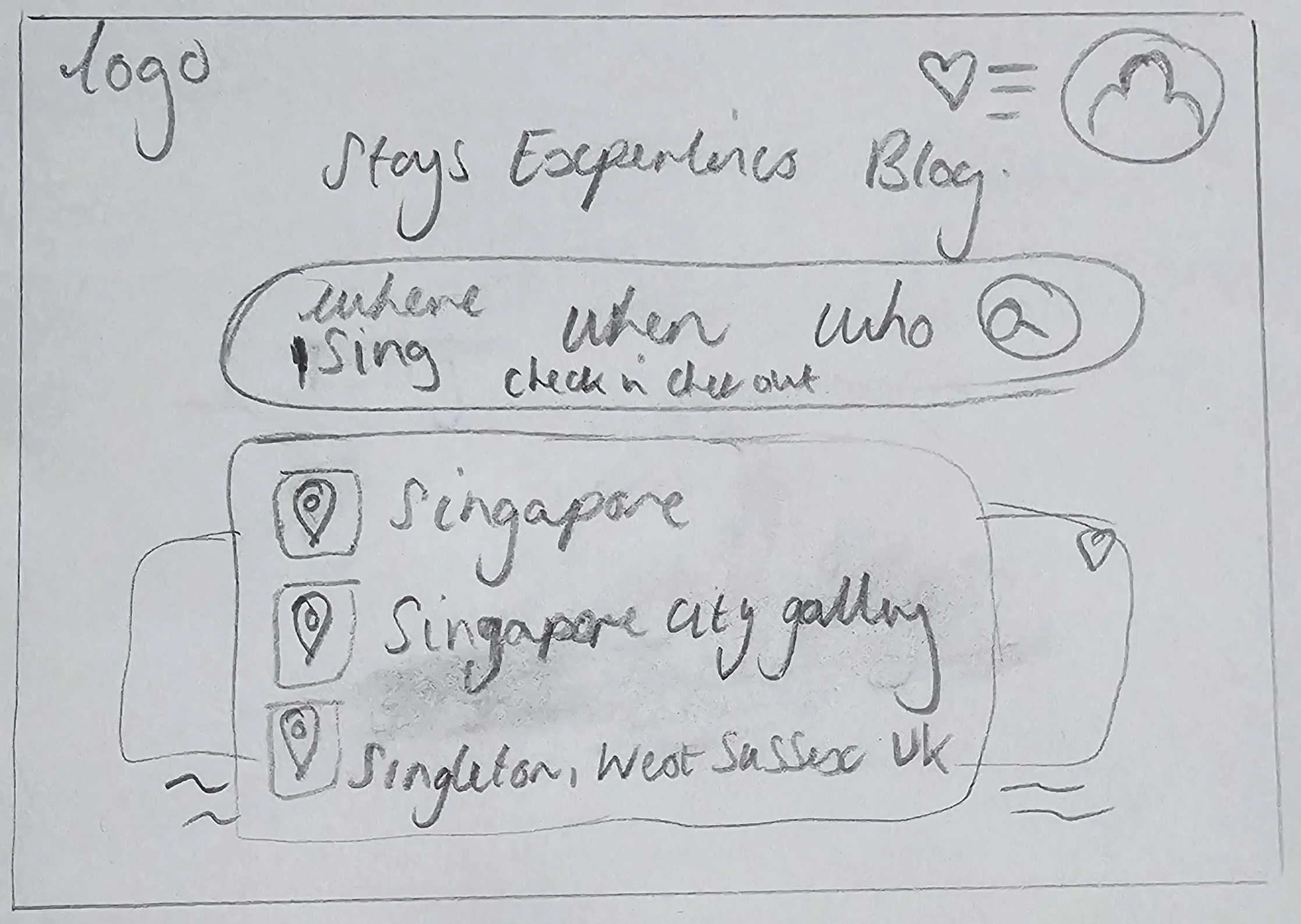
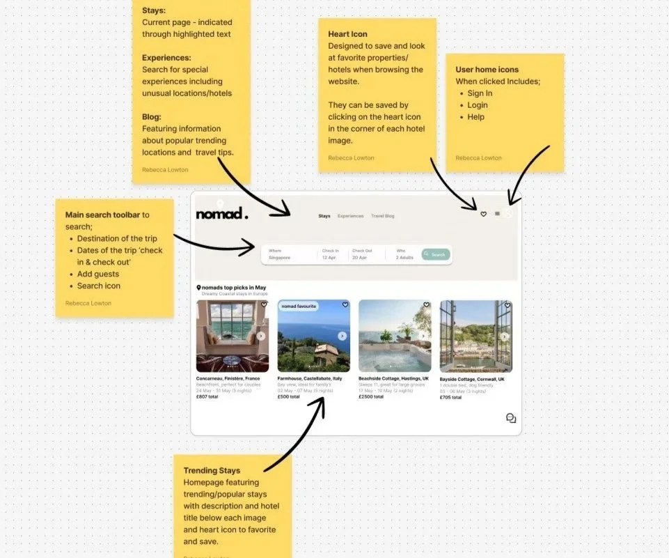
Smart suggestion feature to search for desired destination.
Two month calendar view, with the option to choose flexible dates.
Guest selection including Adults, Children, Babies and Pets.
Search Bar
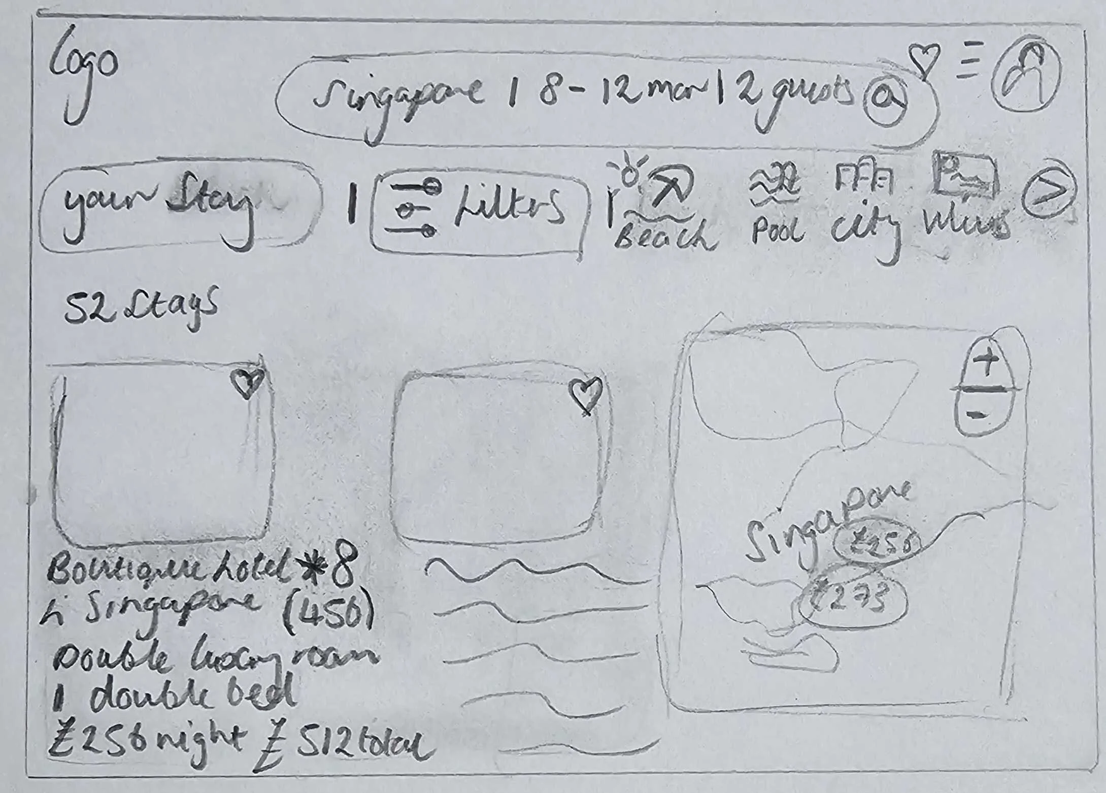
Map View
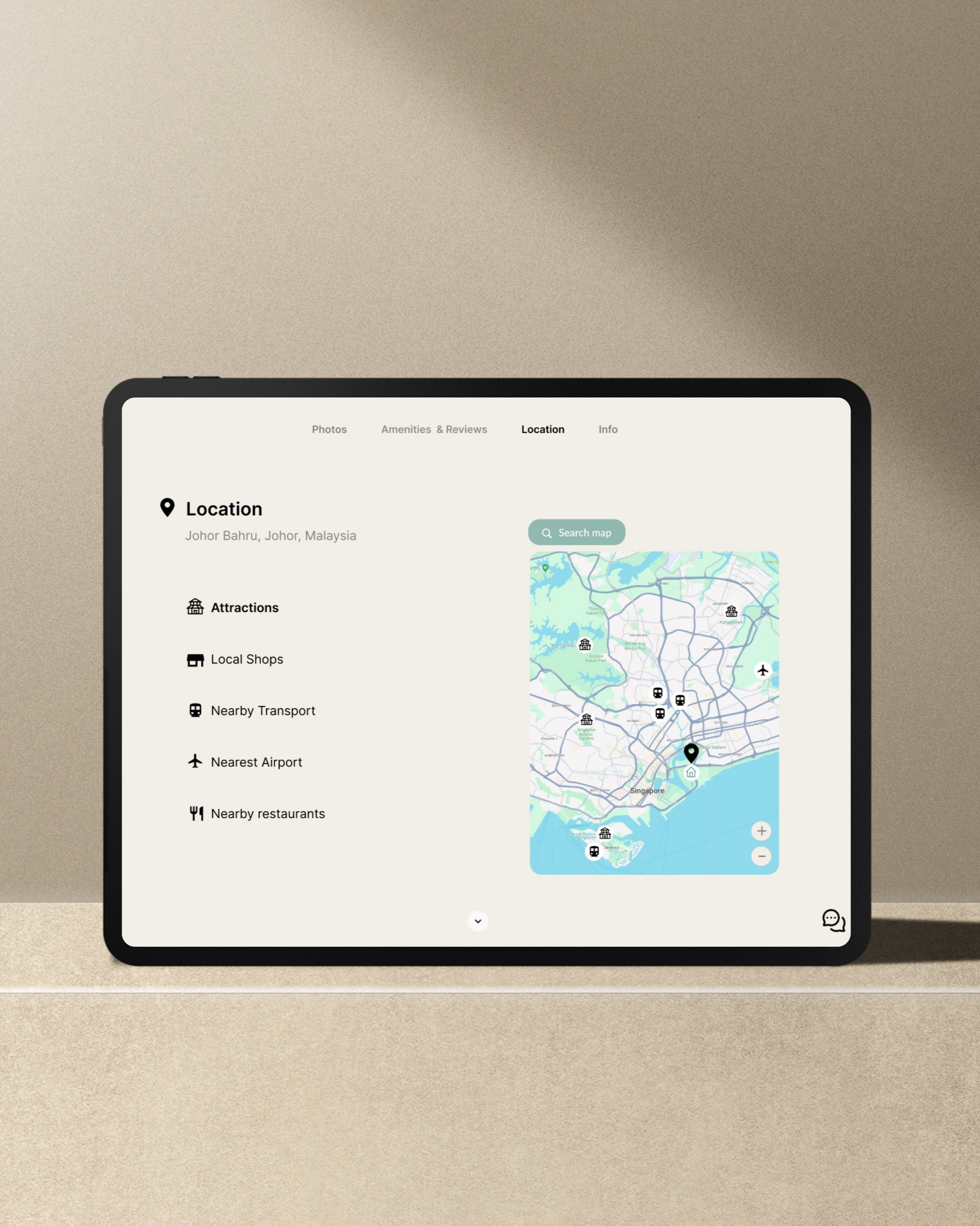
Research found that users have a desire to compare hotels, including their location. The map view allows users to view hotel locations along with pricing and view them alongside one another.
Map Zoom in and out functionality.
Easily view location of hotels to desired sites and local amenities.
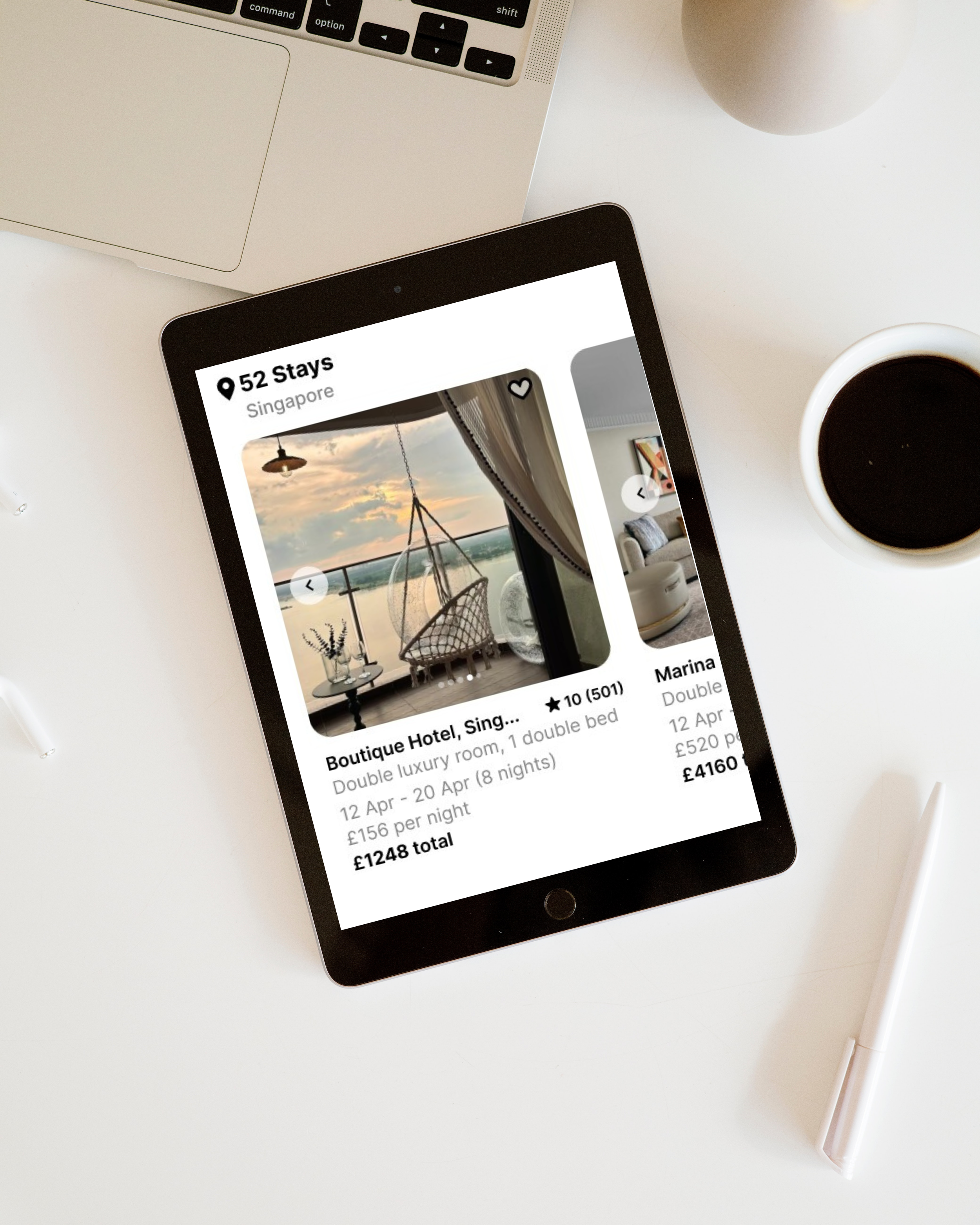
Images
Users expressed a desire to view lots of clear images to obtain a good idea of what their stay might be like.
My user research found that a variety of images provides user security and awareness, feeling more comfortable to proceed with their booking.
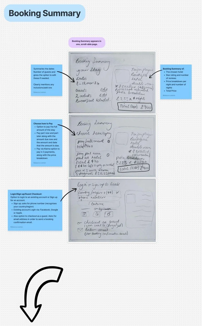
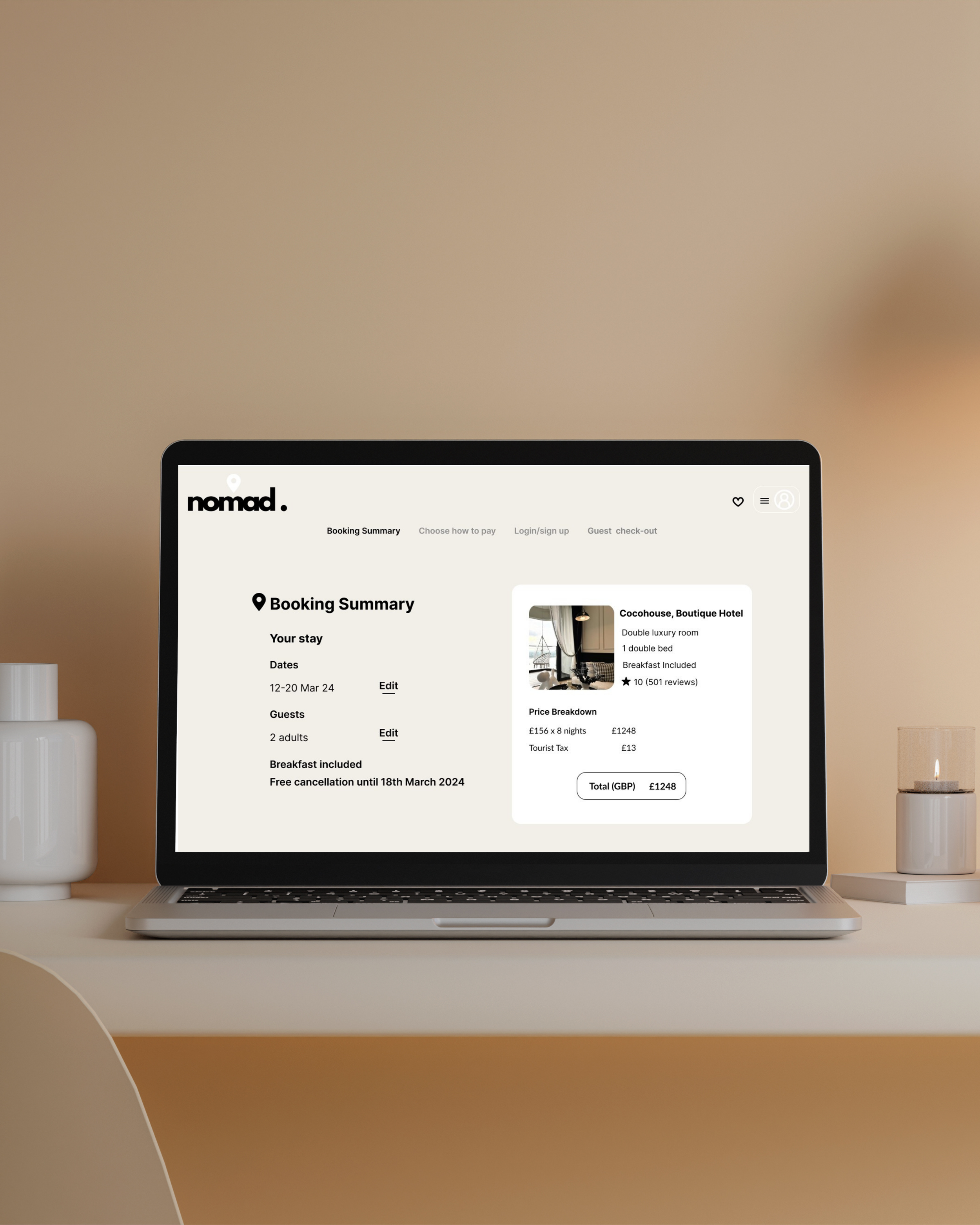
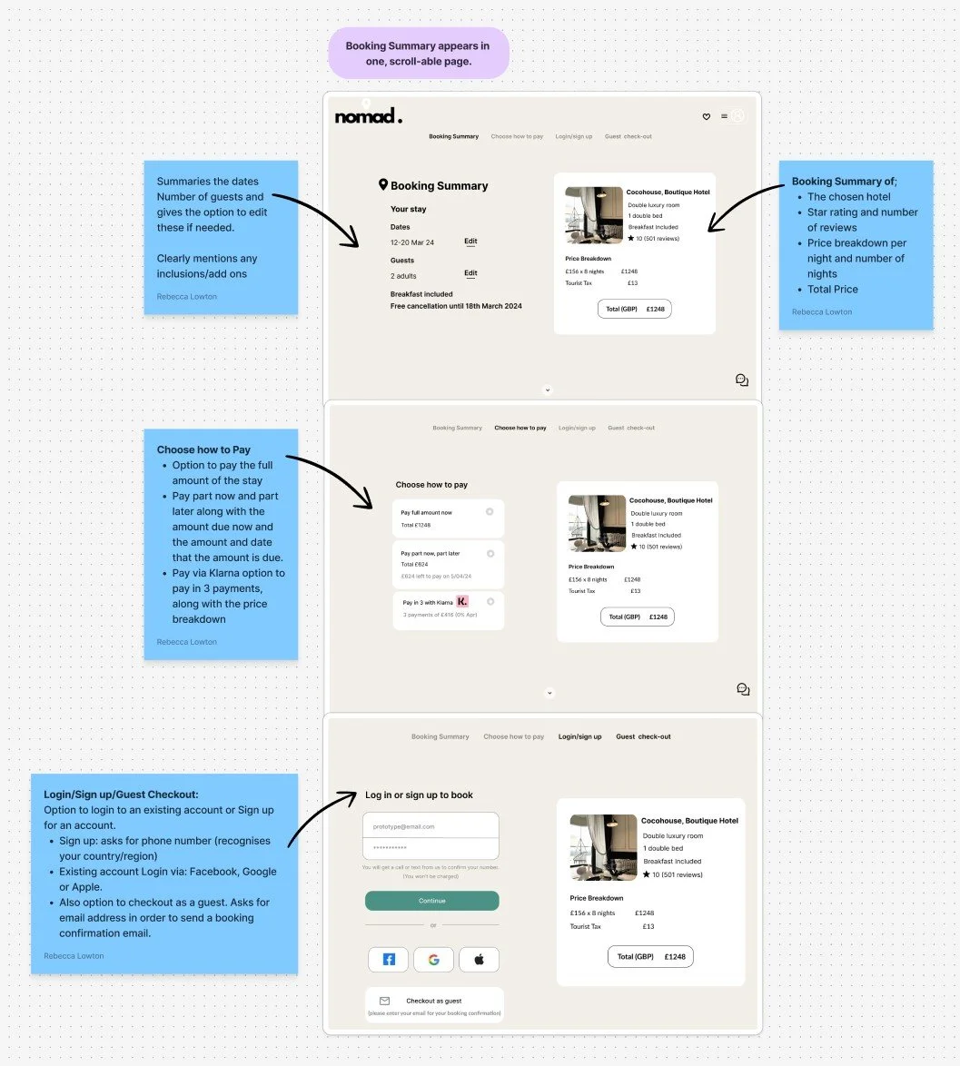
Booking Process
My research revealed that users felt booking processes were very quick. I designed the process to be thorough and clear allowing them to feel confidence in their booking completion.
Users felt a sense of ambiguity around what’s included/not included in their hotel booking when viewing competitor sites.
I created a clear and concise booking summary to present all of the relevant booking information to the user.
Design Evolution

Annotations
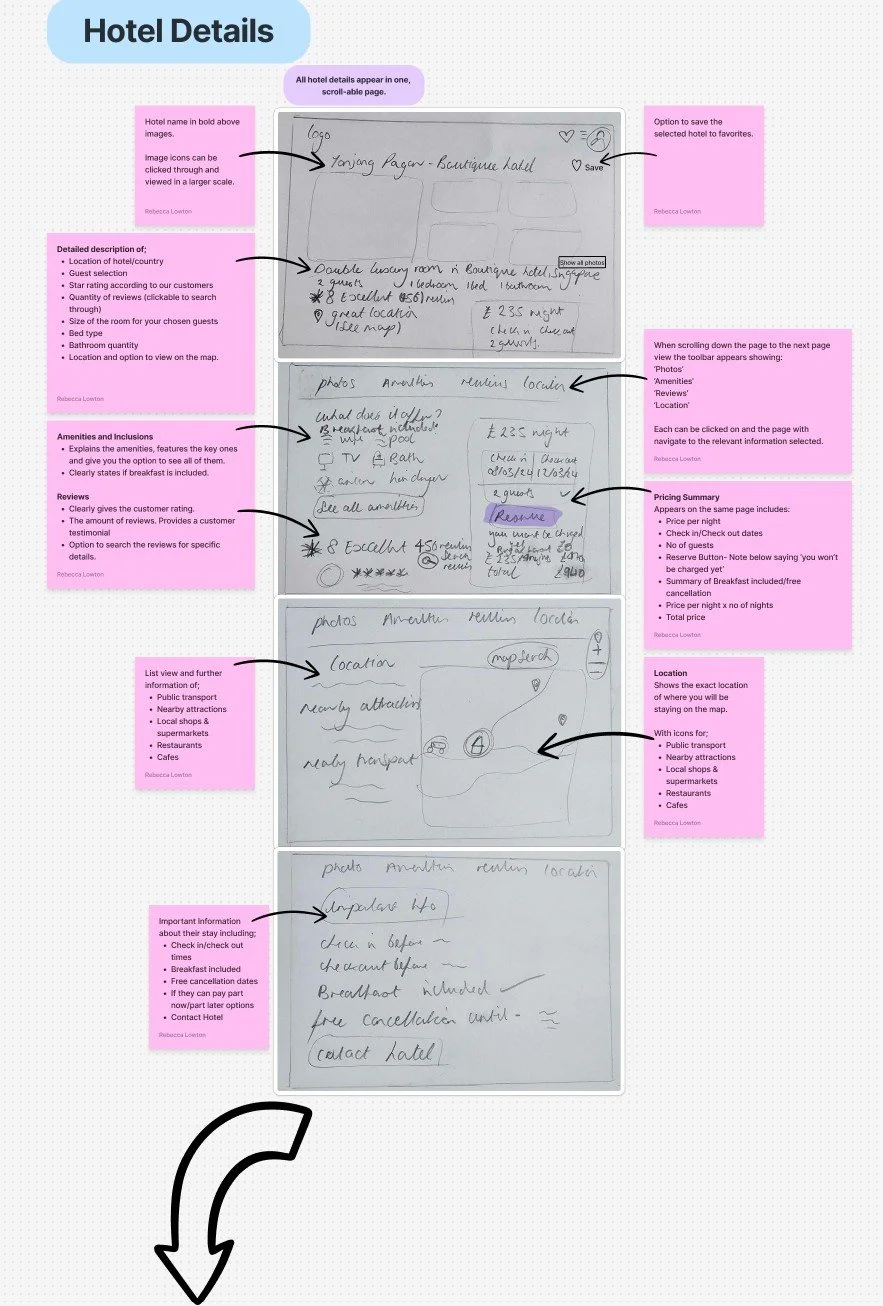
To ensure a seamless handover to development teams. I created details annotations for key screens, clarifying states, interactions, functionality, and design intent.
Providing a blueprint to preserve the user focused experience throughout implementation.
Prototype
Reflection
This project was incredibly rewarding, not only did I learn and apply each step of the UX process,
but I also felt a real sense of accomplishment upon completion. From understanding the landscape and probing user expectations to translating insights into actionable design decisions. This project gave me a comprehensive view of the UX journey and its importance.